10 COMMON MISTAKES IN THE ITEM CARD
- 20 October 2017 10:43:00
- Reviews: 0
- Views: 5192

The product is a conversion page is an online store providing sale. It often lead targeted traffic from organic matter and contextual advertising on commodity low-frequency queries. If the conversion is low, it may indicate gaps in the creation of card products. Today we will talk about common mistakes, which is not worth it.
1. Problems with the design
This refers to the appearance and position of elements. If the site has outdated or awkward design, and the product will adopt the same design. The card must not have any unnecessary distractions, everything must be aimed at conversion.
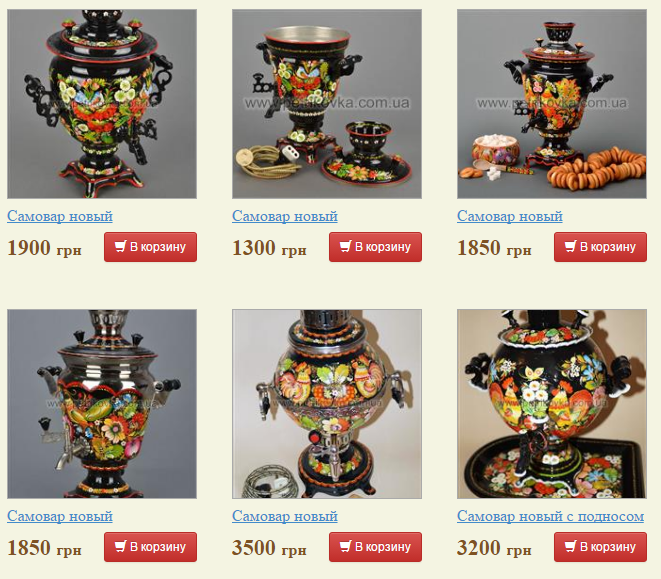
In the example below, after the transition to the product page the user sees anything (the is system units similar goods) but not the information about the product.
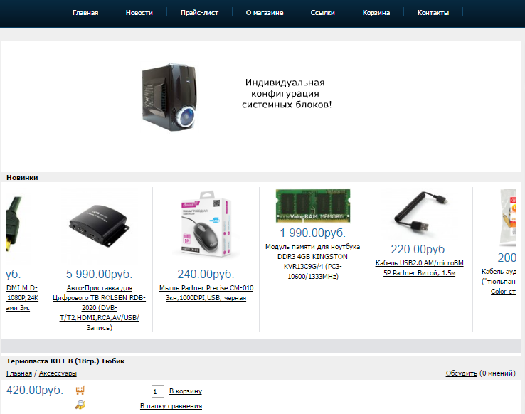
The very same photo and description is below. This approach is invalid — you must first show the product, and then you can and similar products to offer.
Another common problem is poor design of the button "Buy". Here is an example (try to quickly find a treasured button):
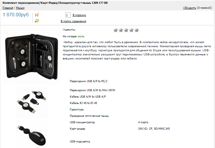
Not the fact that the search button will engage your customers. In addition, this design is not motivated to make the order.
And here is a good example (there's a difference, isn't it?):
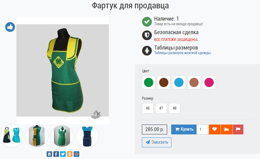
There are many studies on the effect of colors, shapes and sizes of the buttons "Buy" and other elements of design on conversion. If all this into account, the sales will increase even without increasing traffic.
2. The lack of a mobile site
In Russia, only 20% of purchases are made with mobile phones, but if you compare this figure with other countries (Australia — 43%, Japan — 49%, UK — 51%), the growth potential is obvious. If you do not adapt to the market change now, tomorrow you can lose significant market share. Moreover, in 2016 the share of adaptive online stores grew by 55%.
Compare 2 cards products:
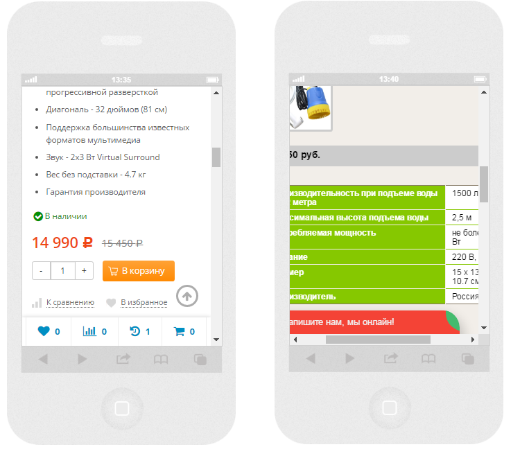
It is obvious that if a user goes mobile and gets to shop with a card non-adaptive (right), he is likely to go back to search and buy a product from a competitor. But adaptive card (left) suitable for viewing on any device.
In addition, the mobile adaptation improves the ranking of online stores in mobile results, so it is not only the key to higher conversions and more traffic. So, if your website is still not "mobile-friendly" in a hurry to rectify the situation.
3. Not specified information about the availability, payment and delivery terms
Delivery time and payment method are the key factors in making purchasing decisions. Moreover, equally important is the delivery charge. So all of this information should be available in the item card:
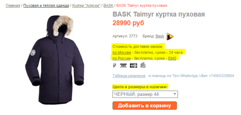
Another important aspect is the availability of the product. If you find that people have spent time, place your order, and there is no good, it will disappoint him, and not the fact that he wants to contact you in the future.
4. The lack of available product description
This refers not specifications taken from the manufacturer's website, namely the description of the product — what it is, why, who, what help, what problems it solves, etc. the text should guide the uninformed user and help him make the buying decision.
Here is an example of such a description:
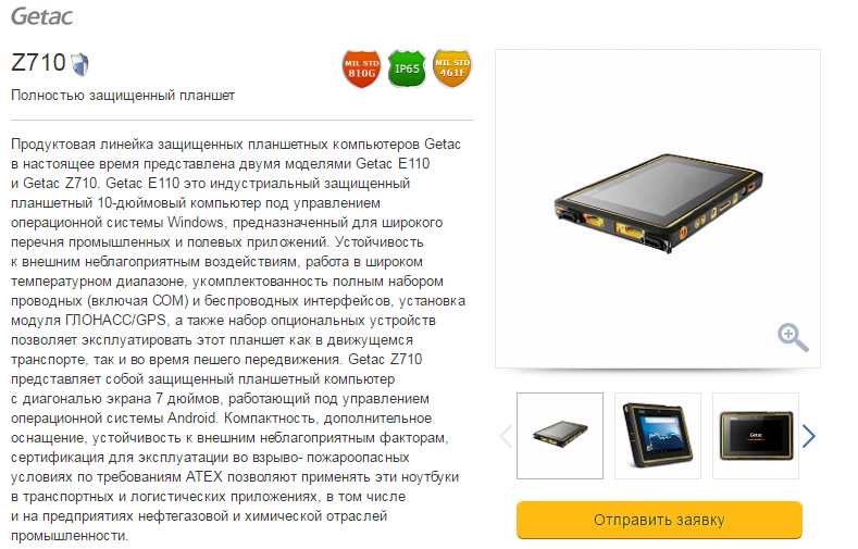
You have explained complex technical specifications and describes the areas of use of the product.
5. No up-sell and cross-sell
Using these tools, the additional sales of the product can increase the average check amount. With the help of up-sell salesman motivates the buyer to buy more expensive products or add options to selected goods. And cross-sell is a way of selling related products.
Here is an example of up-sell:
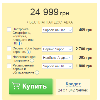
In this case, the basic product offered to add services and options. The total cost of the order increases.
And now cross-sell:
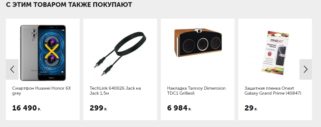
As the main item here was the portable speakers, and the store offered headphones, bumper, protective film, cable, etc.
You can also use a combination of cross-sell and up-sell:

Is the purchase of complementary goods complete with the basic at a better price.
6. No photo of the goods (or poor quality photos)
If a person sees the name and description of the goods, but does not see the image, it with high probability will go to another store. A website without photos is not credible (it seems that it is still in development, is "dead" or simply the owners are negligent of their business).

If you have your own photos, add images from manufacturers ' websites. Photos should be high quality, taken from different angles, with the possibility of increasing.
Some sites go further and make not only photos, but also 3D visualization
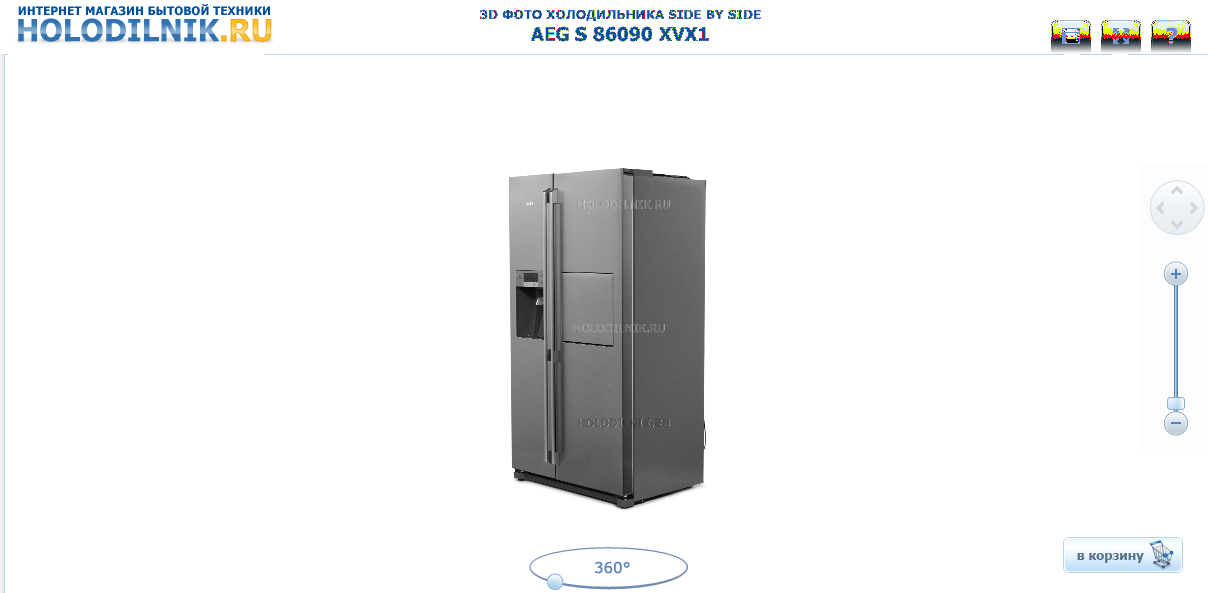
This customer-centric approach, one can examine the item from all sides, and it will bring it closer to the purchase.
7. There is no possibility to leave a review
In the item card you want to be able to leave feedback. This testifies to the openness of the store. In addition, most people read reviews before buying, and they will not have "wander" at otzoviki and forums to find the information you need.And if the right to configure a data markup and to add the evaluation function of the goods, its rating will be reflected in the snippet, which will increase the CTR.

It is particularly important to track the ranking, not to get that item it will be understated — in this case, this option can work against you.
8. No option to purchase in 1 click
It is not necessary to force users to buy only after registration. It's no good. To offer an alternative — a quick purchase. The person clicks the button, enters a name and phone, and then the sales Manager and clarifies order details.
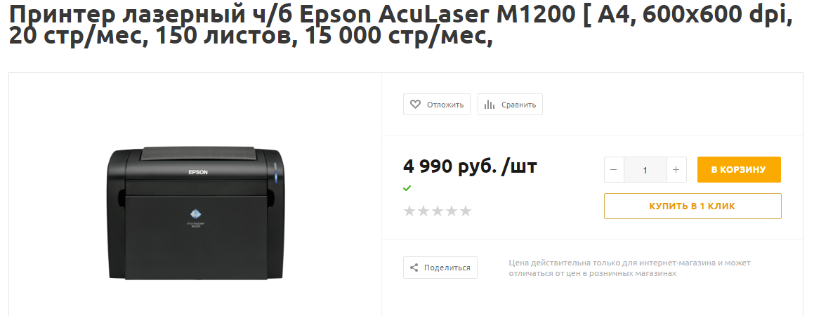
This unobtrusive approach to sales. In any case the contact information you have saved for further work with the client. If you offer registration, explain why this is necessary (a bonus program, an additional discount, gift, etc.).
9. No video
It's not a critical bug, but a unique overview videos (at least the most popular and expensive goods) will attract the attention of the audience and beneficial to talk about products. If you do not have the financial ability to remove the full reviews with the leading, make a video of the unboxing of the product and preview.
10. Inaccurate item name
From the name the client must understand what the product in front of him. The use of similar names or unclear abbreviations is misleading and makes to go into each product and see what are the goods for 3000 rubles different from the goods for 5000 rubles.
